Evolving Doctor Anywhere from a telehealth app into a scalable healthcare platform

company
Doctor Anywhere
time
2023~
Role
Product Design
Keywords
#Strategy under ambiguity #Long-term direction #Designing for scale
A ~2-year UX strategy delivered under real constraints
It wasn’t a single redesign or a “big bang” transformation. It was a sequence of deliberate steps, shaped by real constraints - legacy systems, multiple user types and interfaces (B2C and B2B), regulatory considerations, and a product that needed to keep shipping while it evolved.
At the start of this work, DA was strongly associated with GP teleconsultations. Over time, the product expanded into preventive care, specialist care, mental health, screenings, vaccinations, insurance-linked benefits, and family coverage. The challenge wasn’t a lack of services - it was that the experience didn’t help users understand or navigate that breadth.
At the same time, internal pressure was growing. As new products and initiatives launched, more teams needed visibility on the home page. Adding more tiles became the default solution, slowly trying to turn the home experience into something harder to use and harder to scale, and more difficult to use
This case study shows how I addressed both sides of the problem:
Externally - changing how users perceive what Doctor Anywhere is for
Internally - creating an experience that could absorb growth without collapsing under it
Rather than jumping straight to a new navigation model, I approached this as a long-term UX strategy, delivered in phases:
Building a strong design foundation
Unifying fragmented B2C and B2B experiences
Reframing the app around healthcare needs
Each phase enabled the next. None of them would have worked in isolation.


Phase 1: building the foundation
The first phase of this journey started with a technology-driven initiative.
The app was due for a major rewrite - moving to a new frontend framework and improving overall performance and stability. While the primary driver was technical, I saw this as a critical opportunity to do more than just "port" the experience.
Rather than treating the rewrite as a purely engineering exercise, I used it to establish a solid UX foundation for everything that would follow.
At this point, there was no scope to change backend architecture or rethink core product logic. The constraint was clear: frontend, performance, and experience quality. Within that constraint, the focus became setting the product up for long-term evolution.
I led work to:
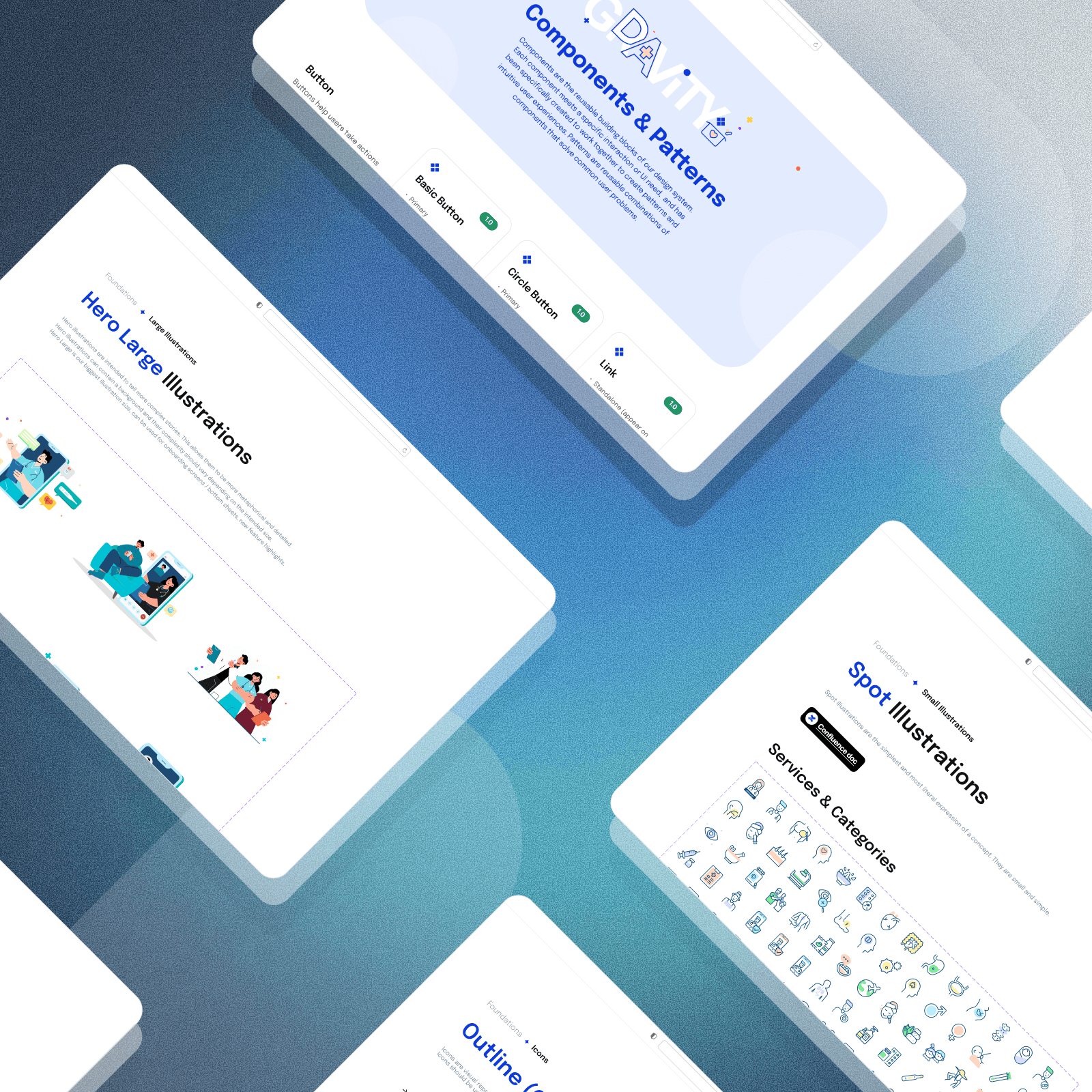
Establish the first design system to bring consistency across the app
Clear accumulated UI and UX debt that had built up over years
Standardise interaction patterns and layouts
Improve information architecture to better support future growth
Align design decisions with the realities of the new frontend framework
Equally important, this phase created space for alignment.
As the app was being rewritten, I worked closely with product, engineering, and leadership to align UX strategy with the broader company vision - not just visually, but structurally: how the product should scale, how decisions should be made, and what kind of experience we wanted to build over time.
Using storyboards to align and inspire
As part of this alignment work, I used detailed storyboards to visualize future-state user journeys. Rather than presenting wireframes or specs, storyboards gave stakeholders a shared picture of where the product was heading — showing how different user personas (someone managing their own health, someone using insurance benefits, a family) would naturally move through the experience. They made an abstract long-term strategy tangible, and helped leadership commit to a direction before any detailed design work began.
This phase didn't change what users could do in the app.
It changed how confidently we could build on top of it.
In hindsight, this foundation work made everything else possible. Without stabilising the UI, reducing UX debt, and aligning teams early, later structural changes would have been fragile at best.

Phase 2: unifying B2C and B2B
For a long time, B2B users had a fragmented experience by design.
They were required to use two separate apps:
the main Doctor Anywhere app for virtual consultations
a separate, insurance-focused app for claims, e-cards, and coverage details
The insurance app had a completely different and outdated look and feel. From a user’s perspective, it didn’t feel like one product. It felt like two loosely connected systems they had to understand and manage on their own.
On top of that, there were legacy system limitations around membership linking. Corporate users often had to manually link their coverage to the main app. When this failed, users could end up paying for consultations that should have been covered by their insurer.
This was a recurring source of frustration:
users didn’t trust whether they were covered
payments failed at the worst possible moment
customer support tickets kept growing
internal teams spent time resolving issues that shouldn’t have existed
At this point, this was no longer just a UX problem. It was a platform problem.
Once the technical constraints were finally unblocked, the goal was clear.
We needed to bring all users into a single app experience, regardless of whether they had corporate coverage or not. One product. One mental model. No workarounds.
I led the UX strategy for merging B2C and B2B into one experience, focusing on:
surfacing coverage and eligibility without overwhelming users
removing the need for manual linking wherever possible
designing one experience that adapts based on context, not separate products
Visually, this also meant retiring the old B2B app and bringing everyone onto the same design foundation established in Phase 1.
This change removed a major source of friction in the system.
It:
reduced confusion around coverage and payment
eliminated a class of avoidable support issues
improved trust at critical moments in the journey
gave us one product surface to evolve going forward
Most importantly, it made it possible to treat Doctor Anywhere as one platform, rather than a collection of disconnected experiences.
Without this step, moving to a needs-based navigation model in the next phase would not have been possible.
Phase 3: moving to healthcare needs navigation
The final phase addressed both the external and internal problems directly.
Through research and testing, one pattern was consistent: users don’t think in services. They think in health situations.
They don’t open the app wanting a “teleconsult”.
They open it because they’re not feeling well, want to stay healthy, need a specialist, or want to understand their coverage.
Reframing the app around healthcare needs allowed us to:
Show the full breadth of care without overwhelming users
Change what the app communicates at first glance
Stop the home page from growing horizontally with every launch
GP remained critical - but it became part of everyday care, not the entire story.
This also required a deliberate shift in mindset. Instead of using the home page as the primary solution for visibility, we reframed it as an entry point, not a catalogue.
The model was designed to be rolled out progressively, with clear guardrails for what belongs on the home page and what doesn’t.
Designing for scale and flexibility
An important part of this phase was designing the home experience with backend realities in mind.
Historically, much of the home page behaviour was hard-coded. This made personalisation difficult, expensive, and slow, and it limited our ability to adapt the experience for different user groups without redesigning or rebuilding large parts of the UI.
As part of the needs-based model, we deliberately designed a single, consistent home layout with clear rules around what could change and what couldn’t.
The goal was to balance:
enough structure to protect clarity and consistency
enough flexibility to tailor the experience based on user context (e.g. B2C vs B2B, coverage, eligibility)
Rather than designing different home pages for different users, we designed one system that could be configured through backend logic. This made it possible to personalise the experience meaningfully while preserving a coherent mental model.
This was a clear shift from how the product had worked in the past and was critical to making the new navigation model sustainable over time.
What changed internally
One of the most important outcomes of this work wasn’t visual.
The needs-based model gave teams a shared language:
Which healthcare need does this support?
Does this require permanent visibility or contextual entry?
Is this core, supporting, or secondary?
Instead of negotiating tiles, we were designing a system that could absorb growth without collapsing. Design shifted from being the gatekeeper of UI real estate to being the owner of a structure that balances clarity, flexibility, and scale.
Impact
From users
Users consistently described the experience as clean, clear, and easy to navigate.
In interviews, many mentioned that the simplified design reduced cognitive load, especially when they weren’t feeling well.
“I like that it’s neat and clean. When you’re sick, your mind is already clouded.”Non-GP services became easier to discover without slowing down core flows.
From the market
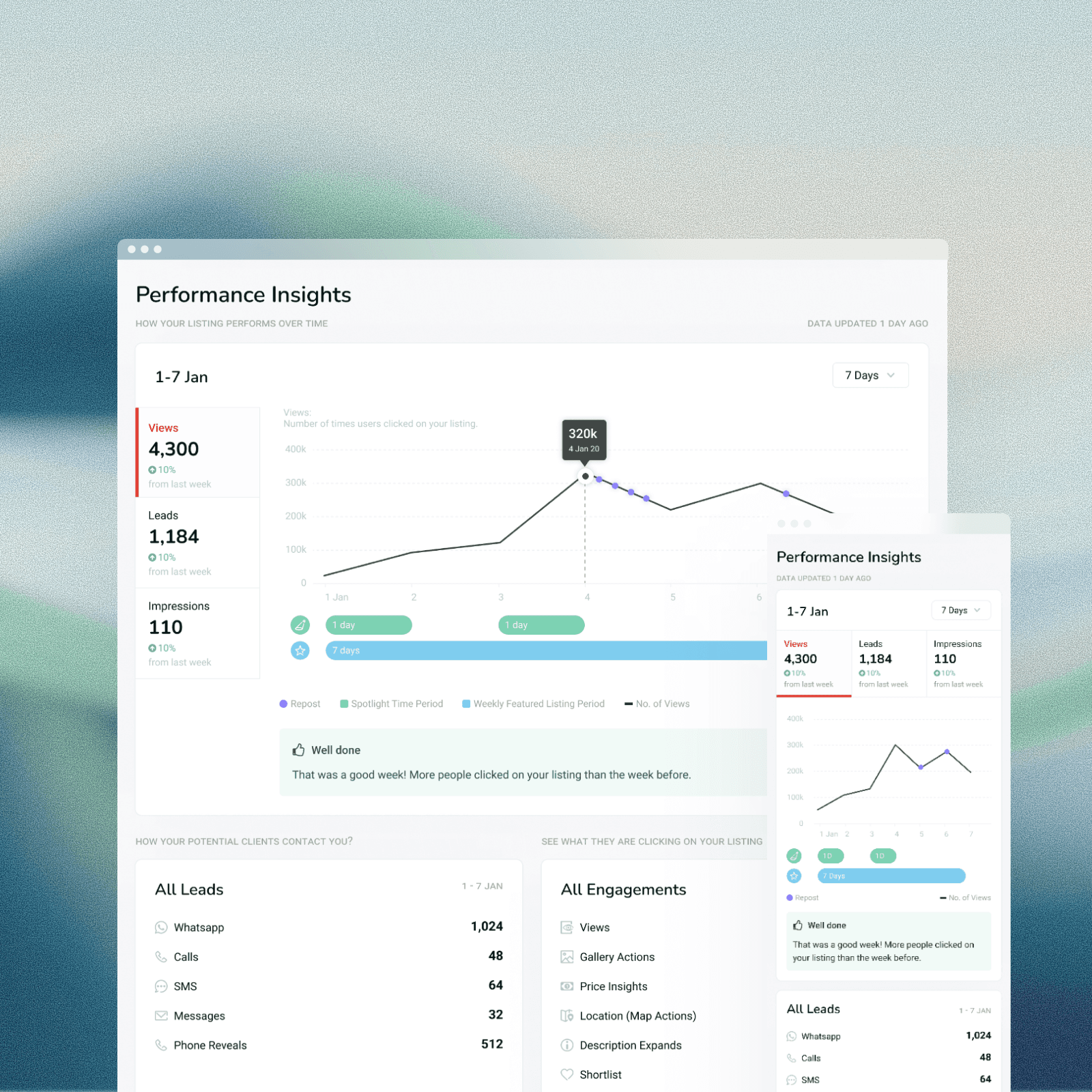
App Store ratings improved significantly after launch.
The App Store rating increased from 3.7 to 4.9, with similar improvements reflected on Google Play.
From the organisation
Fewer issues related to coverage confusion and mislinked memberships
Reduced friction for customer support teams
A clearer, shared understanding of what the app is optimised for - both now and in the future
The impact came from treating the experience as a system rather than a set of isolated improvements.
Reflection
This case changed how I think about my role as a design leader.
A large part of the work wasn’t designing screens - it was aligning teams, timing change, and making trade-offs visible. Saying “not yet” was often as important as saying “this is the direction”.
I also learned the value of using technical initiatives as leverage. The app rewrite and B2C/B2B merge were not framed as design projects, but they created rare windows to establish foundations, reduce long-standing UX debt, and align stakeholders around a longer-term vision.
The result wasn’t just a better app experience, but a product organisation that could make clearer, more consistent decisions about what belongs in the experience - and why.
Next Projects