PG Data
A decision-support product built around supply-side confidence

Marketplaces ask a lot of the people on the supply side.
At PropertyGuru, property agents were expected to behave like small business owners - deciding continuously how much to invest in each listing, judging whether it was working, and adjusting.

In practice, many were making those decisions close to blind.
They could spend more on Boost, on Spotlight, on keyword changes. What they couldn't do was tell whether the investment was working, whether the listing was healthy, or whether the real problem was something the spend couldn't touch - pricing, or demand in that area.
That uncertainty wasn't only frustrating for them. It made it harder for them to justify continued spend on the platform, and it undercut our broader promise of helping agents become trusted advisors to their own clients.
Which made this bigger than an analytics gap. It sat at the intersection of user trust, retention and monetisation - the three things a marketplace cannot trade off against each other for long. A supply-side partner who can't tell whether spending works will eventually stop spending, and no amount of demand-side growth compensates for that.
How might we help agents make informed financial decisions about their listings?
Reframing: from analytics to decisions
The obvious move was to give agents more data. Early research and prototype testing showed quickly that raw numbers wouldn't fix it.
Agents already had basic listing activity metrics. What they lacked was context, market benchmarks, trust in how the numbers were derived, and any guidance on what to do next.
The real problem was translation - turning performance signals into confident action.
That reframe moved the work away from "better reporting" and toward a decision-support product. The goal was no longer to show listing performance, but to answer the questions agents were actually asking:
- Is this listing underperforming?
- Should I keep investing in it?
- Is the problem visibility, pricing, or demand?
- What should I do next?
How we learned it. I ran the discovery as a mixed-methods sequence rather than a single study: quantitative surveys to establish where the problem was distributed, in-depth interviews to understand why, agent personas to hold the segments steady across the squad, and prototype exploration run inside research sessions so we were testing a proposition rather than asking people to imagine one. I used jobs-to-be-done to frame what agents were actually hiring the product for, and ran discovery workshops with PMs, designers and researchers to force alignment on the problem before anyone proposed a solution.
After launch, we kept the loop closed - collecting agent feedback through a post-launch survey as well as the interviews we'd run during design.
That sequence is the reason the reframe held. Surveys alone would have told us agents wanted more data; the interviews are where "how did you calculate this?" surfaced, and that question is what turned a reporting project into a trust project.
A performance system agents could act on
The result was a performance layer showing how listings performed over time, against benchmarks, and relative to money spent.
Instead of fragmented metrics, one coherent flow brought the decision signals together. Agents could see:
- how many people viewed the listing over time
- how many engaged meaningfully
- which channels generated leads
- how promotional tools affected reach and clicks
- how the listing compared to similar properties
- what return they were getting per credit spent
- how comparable properties had historically performed in that location
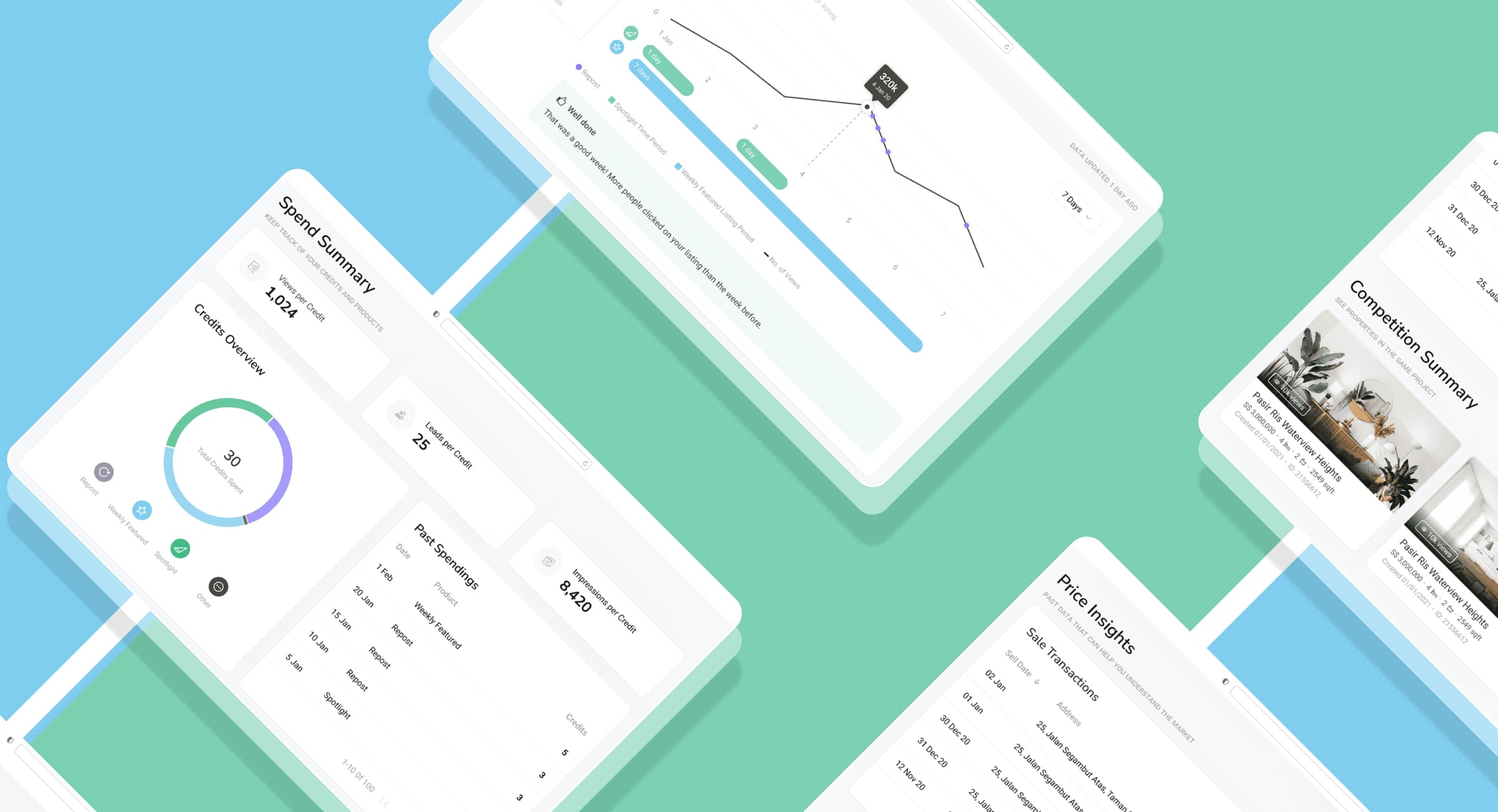
The centre of it was the performance overview: at a glance, whether a listing was healthy, plateauing, or underperforming against the market.
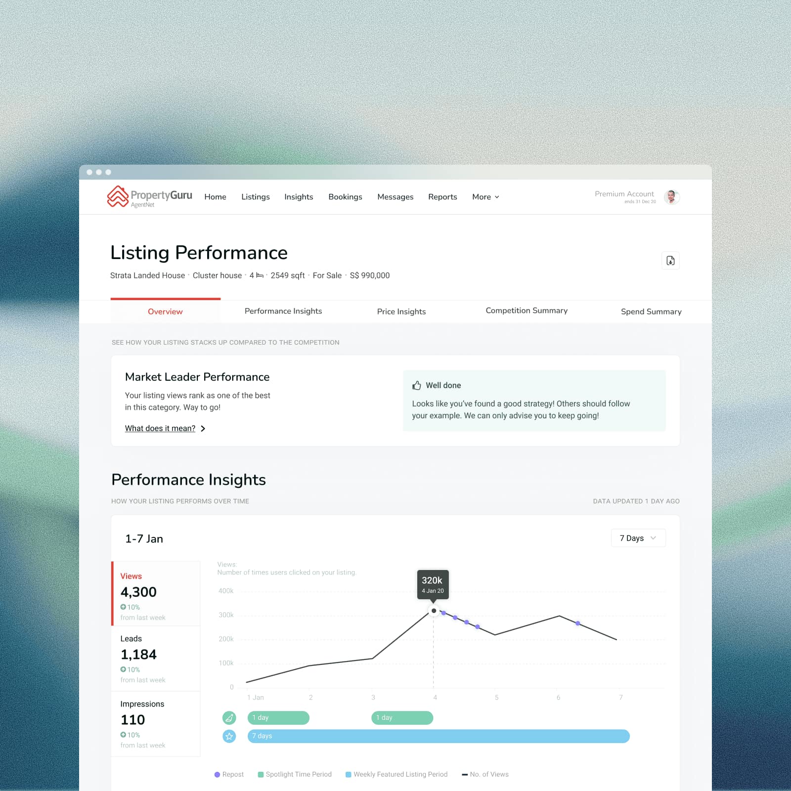
That single view removed most of the ambiguity around whether more spend was justified. The product stopped surfacing metrics and started supporting financial decisions.
Designing trust into the interpretation layer
The strongest signal from testing was that some agents didn't trust the platform's reading of their own data.
The recurring question was: "How did you calculate this?"
It mattered more here than it would in most products, for a structural reason. We were a marketplace telling suppliers how well their spend on our marketplace was performing - and then inviting them to spend more. Any opacity in that logic doesn't read as complexity. It reads as a conflict of interest.
So I introduced transparent explanations for key metrics and benchmarks, making it clear how scores were derived, what benchmark comparisons were based on, and how ROI signals connected to real listing behaviour.
A small product layer with a disproportionate effect. The challenge was never visualising data. It was making people trust the product enough to act on what it told them.
Coaching, not just reporting
Another pattern from research: less experienced agents could see that something had changed, but not what it meant.
They'd see reach declining and not know whether the right response was adjusting price, improving the listing content, using a promo tool, or simply waiting for demand to move.
So I built contextual tips and explanatory guidance into the experience. Rather than expecting everyone to interpret every signal, the product started explaining why a metric might be moving, what was likely influencing it, when promo tools were actually relevant, and what to consider next.
That shifted the product toward coaching through design rather than passive reporting - and it was most valuable for newer and mid-tier agents, who gained confidence both in their platform spend and in the advice they gave clients.
Designing for a tiered supply base is its own discipline. Experienced agents want density and speed and resent being explained to. New agents need the reasoning made visible or they can't act at all. Serving both in one interface, without building two products, was the harder half of this work.
Designed mobile-first, which sharpened the problem. Every new agent-side flow I designed was built mobile-first, and for a data product that constraint is unusually productive. Property agents work between viewings, in cars, on site - not at a desk with a dashboard open. A phone screen has room for roughly one idea, so it forces the question the desktop version lets you dodge: what is the single thing this person needs to know right now? The performance overview exists in the form it does because there wasn't space to hedge.
Four markets, four different definitions of a good listing
PropertyGuru operated across Singapore, Malaysia, Vietnam and Indonesia, and a decision-support product is unusually sensitive to that.
A performance system doesn't just display data - it makes a claim about what good looks like. Benchmarks say this is normal for a listing like yours. Guidance says here is what you should do next. Both are only useful if they're true where the agent is standing.
That made market variance a correctness problem rather than a translation problem. A benchmark built on the wrong comparison set doesn't just under-serve an agent; it advises them to spend money on the wrong thing. Every part of the product that interpreted data on the agent's behalf had to be grounded in their market, not the platform's average.
Malaysia was an explicit business target that year, alongside a retention goal - so the agent tooling wasn't being designed for a single mature market and then exported. It was being designed while a second market was actively being won, which is a very different constraint. You cannot benchmark an agent in a market you are still establishing against a comparison set built somewhere else, and you cannot assume the promotional products, price points or agent sophistication travel intact.
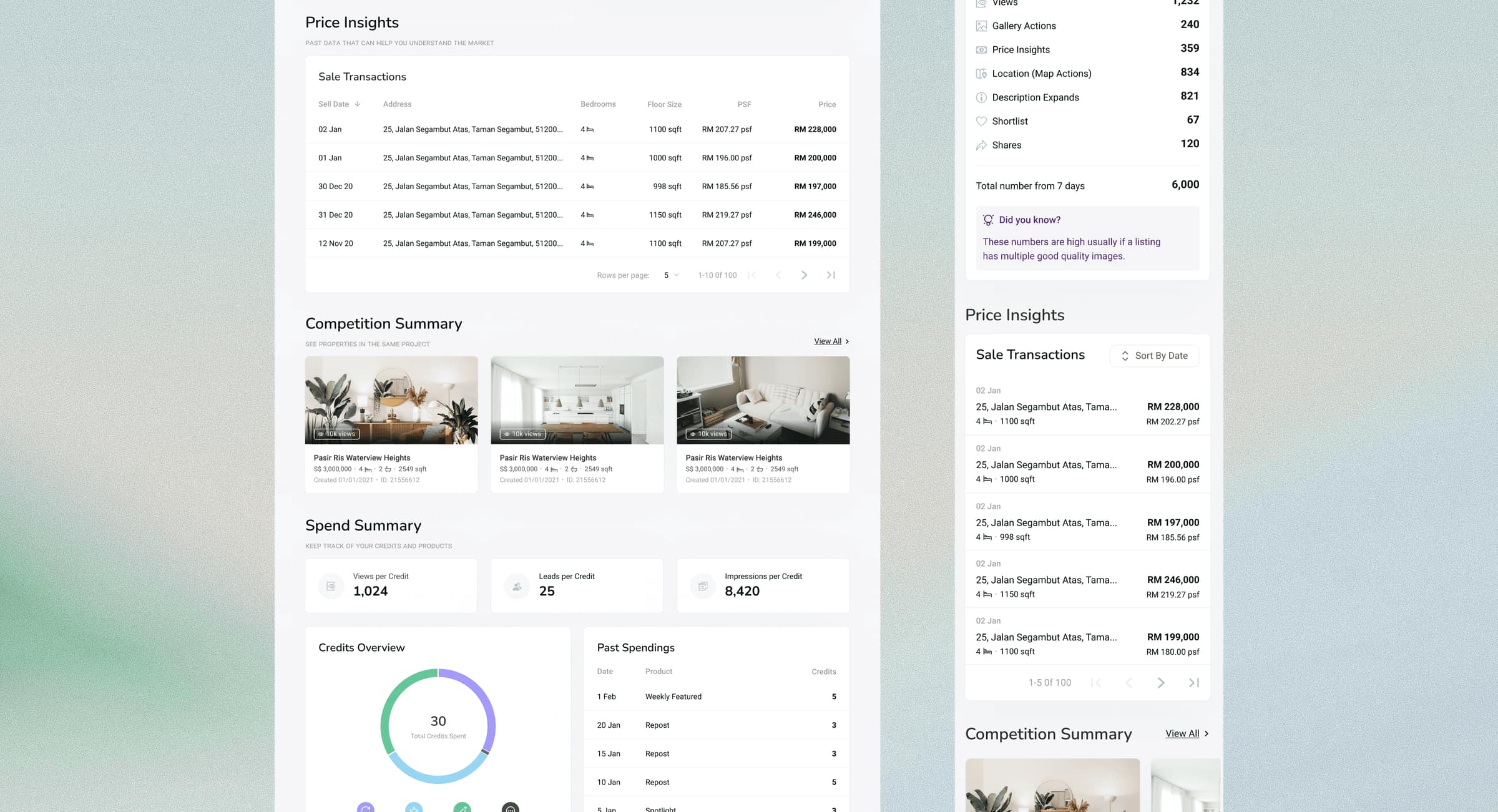
It shows up in the smallest details of the interface. The same transaction table renders Malaysian ringgit against Kuala Lumpur addresses and Singapore dollars against Singapore developments - different currencies, different address formats, different area conventions, all inside a dense table with fixed column widths where a longer number or a longer street name is a layout problem rather than a copy problem. Multi-market design in a data product is mostly this: a thousand small format decisions that have to survive without anyone noticing them.
Language. The product shipped in multiple languages, which for a data-dense interface is harder than it sounds. Charts, labels, benchmark descriptions and explanatory guidance all live in tightly constrained space, and explanation is exactly the content that resists shortening - the tooltip explaining how a score was calculated cannot be trimmed to fit without destroying the trust it exists to build.
Making the data legible
One usability problem surfaced during prototype testing and it's the decision I still think about.
With promotional tools active, the chart became hard to read. Overlapping visual areas created too much noise. The data was correct; the experience asked too much of the person reading it.
I simplified it by moving promotional activity indicators into solid bars beneath the main trend line. The performance trend stayed visually clean, and the promotional context an agent needed was still there - just no longer competing with the thing it was meant to explain.
A small visual decision with a real effect on readability and confidence. In an insight-heavy product, clarity isn't presentation. It's the value proposition.
Matching the form to the question. Each module answers a different kind of question, so each takes a different shape rather than defaulting to charts everywhere. Spend Summary reduces to three normalised tiles - views per credit, leads per credit, impressions per credit - because the question there is a single ratio, and a ratio doesn't need a graph. Credits Overview uses a donut, because that question is composition: what did the thirty credits go on. Price Insights and Past Spendings stay as sortable, paginated tables, because a table is the correct answer when someone needs to scan specific rows and compare exact figures. Competition Summary uses listing cards with photography, because agents evaluate competing properties visually first.
Normalising by spend was the pivotal encoding decision. Raw counts - 1,232 views - answer "what happened." Views per credit answers "was it worth it," which is the question the product exists to serve. Framing the core metrics as return per unit of spend put the ROI logic in the numbers themselves rather than in a separate calculation the agent had to trust or perform.
Engagement was decomposed rather than totalled. Instead of one number, the panel separates gallery actions, price insights, map actions, description expands, shortlists and shares. That's a deliberate rejection of a single "engagement" figure: an agent who sees 834 map actions and 67 shortlists knows something specific - people are checking where it is, but far fewer are saving it - and that distinction points at a real next action in a way a blended score never does.
Every section states its purpose in plain language. "Past data that can help you understand the market." "Keep track of your credits and products." "See properties in the same project." Subtitles that explain what a module is for, in a sentence, at the point of use. In a product built for agents with widely varying analytical confidence, that's not decoration - it's the cheapest possible form of the guidance layer.
Guidance lives in a visually distinct container. The contextual tips - "These numbers are high usually if a listing has multiple good quality images" - sit in a soft lilac card marked with a lightbulb, deliberately separated from the data itself. Keeping interpretation visually distinct from measurement matters in a product whose credibility depends on people trusting the numbers: advice that looks like data is advice that can contaminate it.
Impact
Agents could make more informed, more confident investment decisions - with real visibility into listing health, return on credits spent, lead performance, competitive benchmarks, historical trends and market positioning, instead of relying on instinct.
That created value on both sides of the marketplace. For agents it reduced uncertainty and strengthened their ability to advise clients. For the business it supported retention by making premium promotional tools easier to justify through visible outcomes.
The product moved from selling promotional features to helping people make better business decisions. That's where the retention value actually came from.
The clearest signal came back through the squad's own feedback channels: agents found the listing performance view genuinely useful - and told us the historical data table was the part to improve next. Both halves of that mattered. The first confirmed the reframe from reporting to decision support had landed. The second told us where the next iteration was, and it came from agents rather than from a roadmap.
Performance and revenue figures for this work remain commercially confidential. I'm happy to talk through what we measured, and how we knew it was working, in conversation.
Reflection
What I value most about this project is how clearly it showed that data alone rarely changes behaviour.
The temptation was to expose more metrics and build a more sophisticated dashboard. The actual problem was more human than that. Agents weren't struggling for numbers. They were struggling to know what the numbers meant and what to do about them.
The shift that mattered was reframing the work from showing performance to reducing uncertainty at the precise moment someone decides whether to invest more.
That changed what the product was. Instead of somewhere agents passively checked activity, it became a tool that helped them make decisions, justify spend and improve the advice they gave their own clients.
It also taught me something about marketplaces specifically. The supply side is usually where the hardest product problems live and where the least design attention goes - the tooling is treated as internal-facing, so it inherits internal-facing standards. But suppliers are running businesses on it. Their confidence is the marketplace's inventory.
Designing for confidence rather than visibility is a lens I've carried into every decision-support product since.