Paypr
Designing the calm version of a thing everyone quietly dreads

People don't have a subscription problem. They have a memory problem.
The money leaks quietly. A trial that converted three months ago. A phone contract that rolled onto a worse rate. A warranty that lapsed the week before the appliance broke. A gym membership still going out of an account nobody checks. These commitments live in inboxes, PDFs, banking apps and the back of your mind, and none of them talk to each other. Industry estimates put the cost of that forgetting at over $200 a year per person.
I kept hitting it myself. So another designer and I built Paypr, and shipped it.
A personal project, not a company - evenings and weekends, because the problem annoyed us enough to solve it properly. I owned the brand, the product design and the copy, and wrote part of the front-end myself.
Building some of it mattered more than I expected. Designing a calm interface and then implementing it are different problems: the second one is where you find out that your spacing scale doesn't survive a long merchant name, that the empty state you sketched has three variants in practice, and that the animation you wanted costs more than it's worth. Working in the code closed the gap between what I drew and what shipped - there was no handoff to lose fidelity across, because there was no handoff.
The insight that simplified everything
Every product in this space solves one thin slice: subscriptions only.
The breakthrough was noticing that a Netflix subscription, a phone contract, a fridge warranty and an apartment lease are the same object underneath - a thing with a cost and a renewal date.
Model them as one and the product collapses into something much simpler. No separate tabs to hunt through, no decisions about which section a thing belongs in, no "where did I put that." One timeline, sorted by what's coming next.
That single modelling decision is the reason the interface can be as quiet as it is. Most of the restraint you see downstream isn't visual discipline - it's the dividend of getting the data model right first.
Paper trail: a concept that had to survive contact with an interface
The category has a tone problem. Money apps either nag you or gamify you, and both make an anxious task worse.
I built the identity around a single idea: a paper trail. Every commitment is a card that gets filed. Index-card layouts, ledger rules, receipt textures, monospace labels - "Filed with Paypr", "printed & kept." Physical, calm, and slightly analogue, against a category that defaults to charts and alarm colours.
The test of a concept like this is whether it survives the boring screens. It runs from the marketing site - "Your entire paper trail." - through to the smallest empty state, and it's the same object in both places.
Craft: the decisions inside the screens
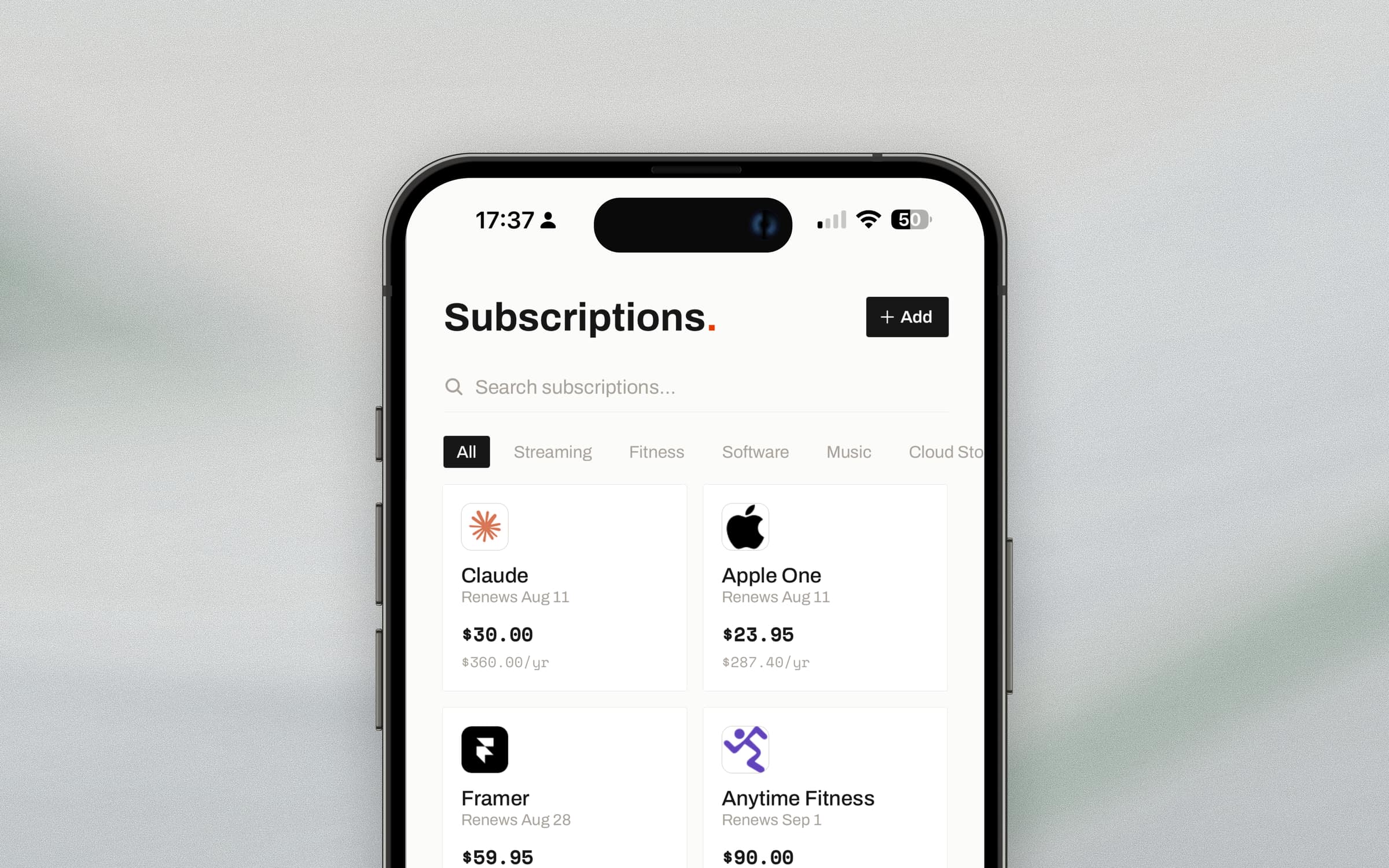
The number is read before it's read. The overview leads with spend, set as $241 in near-black with .88 dropped to grey. Cents are noise at a glance and precision on inspection, so the type does both - you take the magnitude in a fraction of a second and the exact figure is still there when you want it.
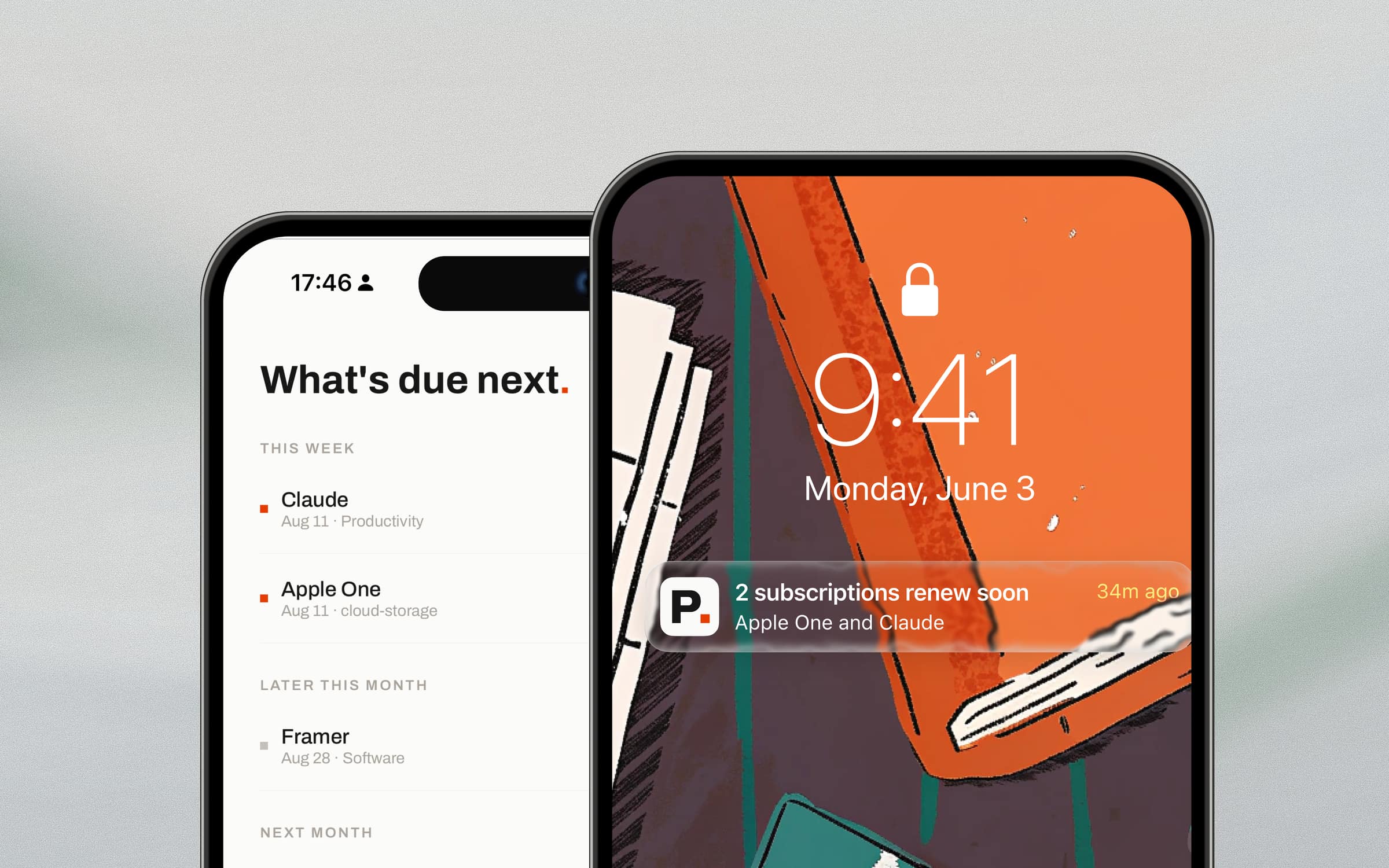
Time is relative before it's absolute. The timeline groups by This week, Later this month, Next month rather than by date, because nobody thinks "August 28th" - they think "not yet" or "too soon." Each row then carries both: "in 2 days" alongside "Aug 11 · Productivity". Relative for scanning, absolute for trusting.
Urgency is encoded twice. A small square sits to the left of every row - red when a charge is imminent, grey when it isn't. It repeats what the dates already say, deliberately. You can read the whole screen's urgency down a single column of colour without reading a word, and it doesn't rely on colour alone because the text is right there.
Money is set in tabular figures, right-aligned. Prices form a clean column you can compare down rather than read across. In a product whose entire job is helping you notice what's expensive, that alignment is functional, not decorative.
One accent, used sparingly. Near-black on warm off-white, greys for hierarchy, and a single red reserved for two things: urgency, and the full stop in "What's due next." Because the red never decorates anything, it always means something.
The chart refuses to be a dashboard. Three months of spend as a bare line with a single red endpoint and two labels. Enough to see a direction; not enough to invite analysis. The product's promise is calm, and a product that promises calm cannot open with a dense chart.
Capture: making the fallback the fastest path
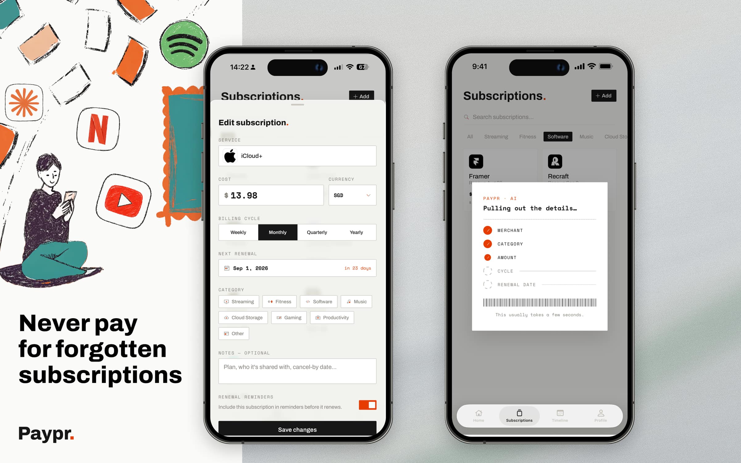
Adding a commitment offers three routes - photograph a receipt, pick an image from the gallery, or upload a document - with the merchant, category, amount, cycle and renewal date read off automatically. "We read every line so you don't have to." You glance and confirm.
The decision I'd defend hardest is the fourth route. Typing it in by hand is the fastest path in the product, and it isn't buried.
It's tempting to hide manual entry once you've built the clever thing, because the clever thing is what you want people to see. But someone who already knows their Netflix renewal date doesn't want to photograph anything - and forcing them through the impressive route to protect its impressiveness is designing for the demo rather than the person. The fallback is treated as a first-class path, not an apology.
Reminders that respect you
The promise is "never miss a renewal," so notification design carried the whole product on its back.
Timing is proportional to the cycle - a day before a weekly, three before a monthly, a fortnight before an annual. Long enough to actually cancel if you'd rather not pay again, which is the only version of this feature that's genuinely useful. A reminder that arrives after you can act on it is just an accusation.
And they fire in your timezone, during waking hours. Never at 3am because a server somewhere hit 9am. "Before the charge. Never at 3am."
That one's a small engineering detail and a large trust decision. A product asking to sit between you and your money gets exactly one chance to wake you at 3am.
Two surfaces, one paper trail
I designed web and iPhone around when you need them, not as duplicates of each other.
The web app is home base - the full timeline, a Renewal Radar that scrubs the next 90 days, spending totals, and a monthly "what can I cut?" review. The deliberate, sit-down view.
The iPhone app is the pocket companion. Paper turns up when you're nowhere near a desk: a receipt at the till, a renewal notice on the train. It's built for filing where you stand, with push before the money leaves and Face ID quick-unlock. Whatever you file on your phone is on the web before you get home.
One account, constant sync, invisible handoff. The same paper trail, wherever you are.
Where it stands
Paypr is live on the web and used by real people to stay ahead of renewals they'd otherwise have missed. The iPhone companion is following.
Reflection
Paypr is a side project, and I'd rather say that plainly than dress it up. Two designers, evenings and weekends, no company behind it.
But it's also the project where I had nowhere to hide. No product manager deciding what mattered, no research team to hand a question to, no brand guidelines to inherit a palette from, and no roadmap to blame. Every default in the product is a decision one of us made on purpose, including the ones we got wrong first.
What that taught me is how much of design quality is settled upstream of any design work. The reason the interface is calm isn't restraint applied at the end - it's the data model. Once subscriptions, contracts, warranties and leases were one object rather than four, there was simply less product to build, and less product is what calm is made of.
It also reset my sense of what "finished" means. Shipping to real people and then living with every default you chose is a different discipline from handing off a design and moving on. Nobody rescues a decision you got wrong; you just watch it not work, and fix it.
That's the part I've carried back into my day job - where I have to earn the authority Paypr simply handed me.