Gravity
Design systems and enablement at scale

Gravity started from a pattern I could see getting worse every quarter.
Doctor Anywhere was growing fast. What began as a telehealth-first experience was expanding into a much broader healthcare ecosystem - new products, new journeys, new partner experiences, and steadily more white-label requirements across B2B and B2C.
The ambition of the company was evolving quickly. The way we designed was not.
Teams were solving the same UI problems independently across products. Separate Figma files existed per brand and platform. Interaction patterns were drifting. Every white-label request created more operational work than it should have.
The easy diagnosis was inconsistency.
I thought the real issue was structural. This was an early signal that our design operations wouldn't scale with the business, and the cost wasn't visual - it was the growing share of everyone's time spent maintaining, recreating and re-aligning work that should have been systemised once.
So I treated it as an opportunity to fix the root, not the symptom: not another UI library, but the first multi-brand, cross-platform design system that could act as shared infrastructure for the company.
Building the foundation before the pain arrived
The system started as an initiative I drove myself, before there was a mandate for it.
That timing was deliberate. Foundations are cheapest to lay before everyone is certain they're needed, and impossible to lay once every team has already built their own workaround.
The early focus was defining foundations clearly enough to support the scale we knew was coming: multiple brands, multiple product surfaces, multiple teams, a growing white-label business.
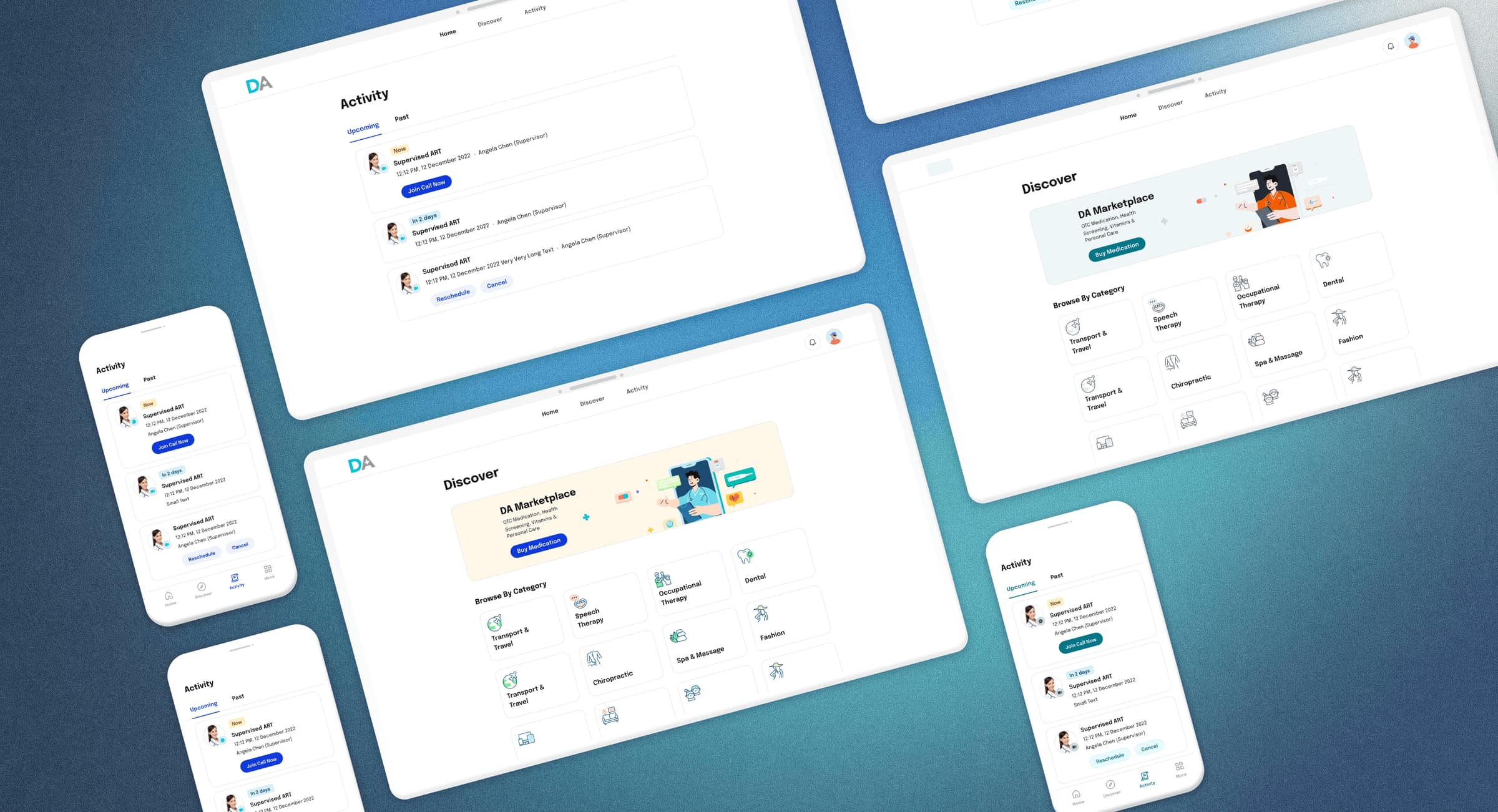
The principle I held from the start was that this could not become a designer-only tool. A Figma library solves a local design problem. It doesn't solve an organisational one. So I positioned Gravity as something larger - a shared framework for how Doctor Anywhere designs, builds and evolves experiences.
That framing turned out to matter more than any component. Most of my effort went not into building the system but into helping teams see that it was directly connected to things they already cared about:
- delivery speed
- implementation quality
- scalability of white-label work
- long-term maintainability
- accessibility
- brand consistency
Get that understood early enough and adoption happens on its own as the system matures. Skip it and you spend two years persuading people one ticket at a time.
The proof: rebranding an entire product by swapping tokens
Three years after Gravity started, the company decided to retire its B2B brand and launch a new one. That decision is the best test a design system can be given, and it's the reason I'd point to Gravity as more than a component library.
The B2B platform - the HR portal, the member experience, the insurer-facing surfaces - was exactly the kind of interface that accumulates the worst debt. Fragmented, inconsistent, styled differently in different corners, expensive to maintain, and with no brand coherence holding it together. It was also the part of the business about to be relaunched as Soda.
Without a system, rebranding that platform means redesigning it. With one, it means changing what the tokens resolve to.
I planned the transition as a staged roadmap rather than a cutover, because a live B2B product with paying customers cannot be rebuilt in one release:
- Phase 1 - establish the Gravity look and feel on the landing page and quote flow, before any reusable components exist
- Phase 2 - every newly redesigned screen built from Gravity, while the rest of the portal stays on legacy UI. The first reusable components land here
- Soda 1.0 - the fully self-serve experience and new marketing site, built on Gravity components, and the DA Care colour tokens swap to Soda colour tokens
- Soda 2.0 - inpatient benefits and insurer partnerships, on the same foundation
- Soda 3.0 - the entire HR portal, including member and insurance experiences, running on Gravity
That fourth bullet is the whole argument for systems work, stated as a delivery step. An entire product changed brand identity through its token layer, while the interaction patterns, component behaviour and information architecture underneath stayed exactly where they were. Users of the HR portal got a new brand; they didn't get a new product to relearn.
The staging mattered as much as the architecture. Running Gravity and legacy UI side by side for a period is uncomfortable - there's a visible seam, and someone always asks why half the portal looks different. But batching the migration by module (navigation, onboarding, dashboard, people, plans, then claims and analytics) meant each batch shipped and stabilised on its own, rather than the whole thing waiting on the slowest piece. Design handoff ran ahead of implementation in tracked batches, so engineering was never blocked and design was never speculating.
Multi-brand as a portable problem
A major unlock came from centralising the system on tokens.
Before that, supporting multiple brands meant maintaining parallel files and repeating the same update in several places. That model doesn't scale - it just gets slower until someone notices.
Moving to a centralised token architecture meant a single update could cascade consistently across product surfaces. For white-label work the effect was immediate: the time to create or update a branded experience dropped substantially, and so did the mental overhead of doing it.
The structural insight has stayed with me. Supporting many brands from one system is the same problem as supporting many markets from one product: decide what is genuinely universal, decide what must flex, and make the boundary explicit enough that people can move quickly on either side of it without asking permission.
Every difficult decision in a multi-brand system is a version of that question. Is this component's shape part of who the brand is, or is it just how it happened to be drawn first? Get it wrong in one direction and you produce rigidity teams route around. Get it wrong in the other and you've built a library, not a system.
In practice Gravity was carrying both dimensions at once: brands and market variants, from a single architecture, without forking the codebase. A white-label partner and a new country are different requests arriving at the same door - each one asks the system "can you look like this, behave like this, and comply with this, without becoming a separate product?" A system that can only answer the first is a theming layer. A system that can answer all three is infrastructure.
This is also why I'd argue against the common instinct to treat localisation as a late-stage concern. By the time a product has been built for one market, the assumptions are already load-bearing - hard-coded strings, layouts tuned to English text lengths, components that quietly assume one currency, one date format, one regulatory path. Retrofitting those is expensive and never fully succeeds. Deciding at the token and component layer that market is a variable, before you need it to be, costs almost nothing.
Accessibility as a design principle, not a checklist
One of the most strategic moments came when the company's brand direction started to shift.
Doctor Anywhere was moving from being strongly associated with virtual consultations toward a broader healthcare and lifestyle platform. That change had to feel coherent everywhere - in the product, across B2B experiences, and in marketing.
I worked closely with the marketing team to redefine the visual language so it could carry the broader ambition without becoming impractical for product teams to use at scale.
Accessibility became the anchor of that work. We introduced a new accessible colour system and UI foundations aligned to WCAG, which made the product feel more modern while measurably improving usability for everyone.
In healthcare that isn't a compliance exercise. The people using this product are frequently unwell, frequently older, frequently stressed, and often reading on a phone in poor conditions. Contrast and legibility are not accessibility features in that context. They're the product working.
This was the clearest example of Gravity acting as a bridge - between product design, brand evolution, accessibility and implementation reality. Instead of those four streams drifting apart, the system gave them one shared language.
Scaling through people, not through headcount
The part of this I value most is how my own role had to change as the system matured.
Gravity began with my hands on it directly. As adoption grew, the constraint stopped being system quality and became something else: I was becoming the bottleneck for a thing whose entire purpose was to remove bottlenecks.
The answer wasn't to do more of it myself. I brought in two strong designers and shaped a horizontal UI function supporting both the B2C and B2B streams, then focused on making them autonomous rather than dependent - setting the roadmap with them, running critique, and helping them judge where the system could create the most leverage.
That meant a shift in what I contributed. Less production, more of the things that make other people's production better: defining principles clearly enough to be applied without me, reviewing work in a way that taught the reasoning rather than just correcting the output, and being decisive about the small number of decisions that genuinely needed a single owner.
Design operations changed shape as a result. Rather than product teams solving visual consistency locally, there was a shared layer responsible for system evolution, reusable patterns, accessibility standards, white-label scalability and design QA.
Starting by proving value through execution, then scaling it through other people, is how I prefer to work - and the second half is the part I had to learn.
Impact
The measurable outcome was a ~30% improvement in design efficiency.
The more important outcome was cultural. Gravity established a shared understanding that design quality, accessibility, speed and brand consistency shouldn't depend on individual teams reinventing solutions.
It improved:
- consistency across products and brands
- speed of white-label implementation
- collaboration between B2B and B2C teams
- design QA efficiency
- implementation confidence
- long-term maintainability
Most significantly, it changed what design was for inside the company. Design stopped being understood as a function that produces outputs and became one that builds the conditions for good outputs.
The work was recognised externally. Figma featured Doctor Anywhere as a customer story, highlighting how Gravity let the team design healthcare experiences faster. Read the Figma feature →
"A design system isn't just for designers - it's for everyone."
Reflection
What I value about Gravity is that it's the clearest example of the kind of design work I care most about - not improving what ships this quarter, but making the next fifty decisions better.
It needed systems thinking, stakeholder alignment, teaching, and the judgement to know when to stay hands-on and when staying hands-on was the problem.
It's also where I learned that a design system is only incidentally about components. What it really produces is agreement - about what's universal, what's allowed to vary, and who gets to decide. The components are just where that agreement becomes visible.